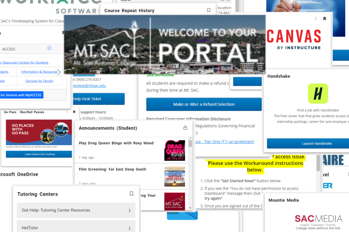
This fall 2024 semester, Mt. SAC overhauled the portal touting it as a customizable dashboard with efficient data access. It fails to be “efficient” with its confusing, cluttered grid layout that overwhelms users rather than intuitively guides us.
I’ve already graduated from this college and received an AA-T in Journalism, but I came back this semester because I’m going to transfer in the spring. With nothing much to do, I crawled back to this destitute publication which meant that I had to register for a class.
Unfortunately for me, the once streamline and easy-to-understand portal I used for two years was redesigned to what we have now. As I opened the portal, the caucasity flashbanged my poor eyes leaving me lost in the cacophony of boxes.
It took me a solid 10 minutes to find the “Register (Add or Drop) Classes” button through the unorganized mess of white boxes inside more boxes. It feels like they’re trying to hide from me.
Trudging through the landfill of boxes was just half of the struggle. That in combination with the new long load times that made what used to take two clicks into a scavenger hunt where if I clicked the wrong button, I’d be put in timeout for an excruciating 30 seconds. It’s like walking into a minefield to find the penny on the ground.
But that’s the Ellucian experience. The same company that did the agonizingly slow Mt. SAC MAP website is now in charge of the portal and it shows.

(Adam Young)
These problems wouldn’t have existed if Mt. SAC hired any graphic designer because this portal fails in one of the simple rules in web graphic design– hierarchy. I can already feel the $2.5 million deficit Morris Rodrigue announced.
Hierarchy, put simply, is the obvious concept where the important buttons are bigger and at the top of the screen while the less important buttons like the “Parking (Employee)” tab are at the bottom of the page.
The Mt. SAC logo is smaller than the font for the “IT Help Desk.”

With the new compact design, everything is now in drop down menus that you need to scroll through to see the full information in the box. Great! Let’s walk through the user experience.
So first, we sign into the portal and wait for it to load. For reference, my computer loads all of YouTube in three seconds while it takes almost nine seconds to load the portal. For how simple this website is in comparison to a multi-billion dollar video sharing platform with complex recommendation algorithms, I am almost more impressed with how they made the Mt. SAC portal so slow.
After staring at a blank screen for a few seconds, we are greeted with half of the screen filled with tabs that don’t work because I would have to sign in to Microsoft for it. If I wanted to look at my Outlook Mail, why would I launch the student portal for that?
Now it’s time to find the button for the “Register (Add or Drop) Classes” button. Where is it? In the better portal, it was under the Student Self Service category so I’ll look there.
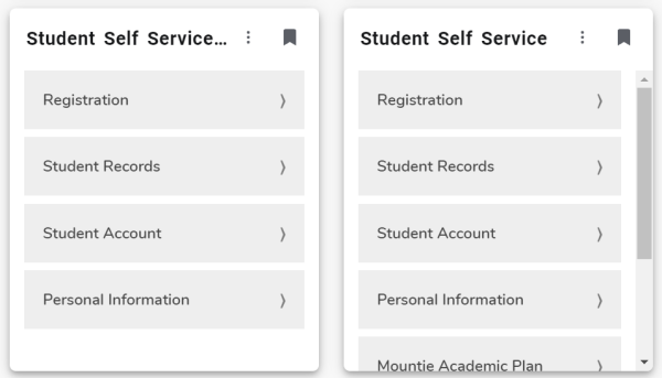
As I scroll down, my scroll wheel gets stuck on a smaller window. I can’t take it anymore. Please, I just need to add a new class.
There are two tabs titled “Student Self Service” and I want to throw myself off the third floor of building 26D and splat onto the dozens of construction machines and alter the course of this college’s footprint forever.
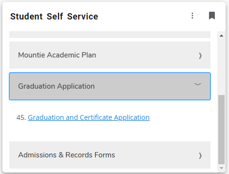
After dramatically scrolling down the correct but small Student Self Service , I finally find the button I was searching for and decide to take advantage of the “customizable dashboard” feature. As I drag the window and place it at the top of my portal, all of the other windows refresh.
We finally completed our goal after 300 words. Now some nitpicks.
Why is the staff portal now combined with the student portal? Why is there a full tab for staff announcements and student announcements that have the same exact information? Why are all the useless tabs for students at the tab? Do you want all 40,000 students to have to put their limited time into organizing their own portal? You know that most students rarely use the portal right?
While exploring the portal, I discovered that there are even more windows in the “Discover More” button. There are 104 different boxes and each of them have to load individually. I reached the bottom of the page and the boxes stopped bothering to load. My home’s wifi died as I investigated this section of the portal just to add to my pent-up frustrations.
There is a window for the stock market. Let me check my Mt. SAC student portal really quick to see if I’m up on my NVIDIA stocks today.
The new portal has caused me great pain and mental anguish.


Richard Sequeira Teixeira Alves • Sep 20, 2024 at 12:00 am
Your article came in just in time! I remembered the old portal being straightforward with all the opinions on a nice list. It is a nightmare for those who have used accessibility software. It is also painful to navigate the barrage of boxes and dialogues to make an appointment to see a counselor or access the class schedule. Like the old-time proven saying, “If it ain’t broke, DON’T FIX IT”.
Diappointed Taxpayer • Oct 1, 2024 at 1:39 pm
The Luminis portal was end of life and Ellucian would no longer support it. They could have picked better as they went through the process but ultimately they took the less mature solution from Ellucian because it was easier, even if you can’t do much with it for a long time and are basically a paying beta tester. It is a wall of texts/links and it is disappointing for sure, not to mention the god awful dated interface that completely clashes with the “modern” look of the framework. Let’s get a new portal but make it look like the old one we got rid of.